
Proof lives in what we took away.
Every project here is defined by a friction problem we solved. Not a feature list. Not a spec delivered.


Removing the pause before the tap
A fintech startup's onboarding took eleven steps. Users quit at step four. We rearchitected the flow to three decisions — each one feeling inevitable.
Result: completion rate rose 61%. The interface stopped being a process and started being a handshake.
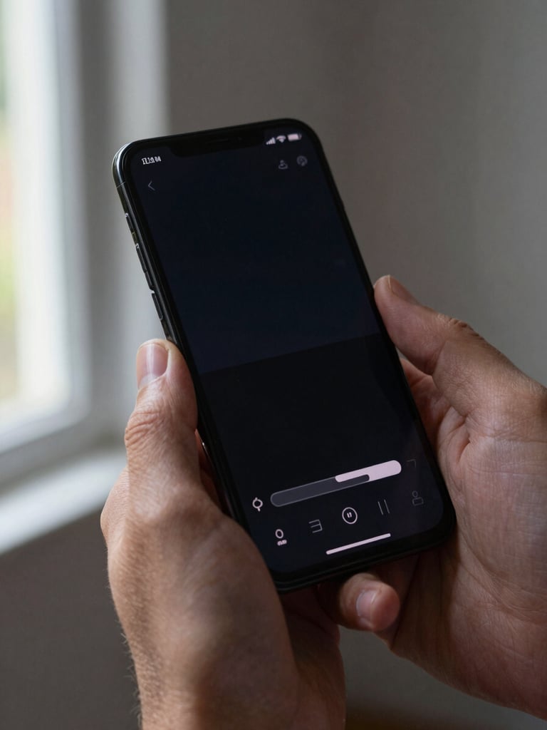
Weight and timing in every toggle
A media brand's content app felt thin — fast to load, slow to trust. We rebuilt the micro-animation layer so every state change had the right duration and easing.
Retention at day-seven doubled. Users described it as 'polished' without pointing to a single feature.
Architecture built around the gesture
A logistics startup needed live tracking that felt instant. The data was fast — the UI wasn't. We co-designed the state model and the interaction layer as one problem.
Perceived load time dropped to under 200ms. Drivers stopped calling support to confirm their status.
The test: does the interface disappear?
We take projects from founders and product leads whose app is their primary product experience — not a companion to something else. That distinction shapes every architecture and interaction decision we make.
Have an app that deserves better feel?
Tell us the interaction problem you're solving. We'll tell you how we'd approach it.